Behind the Scenes of a Colorful Mid-Century Modern Kitchen Renovation
At some point in our lives, we have all lived in a space that simply didn’t work. Maybe the corner position of the fireplace made your living area feel small and awkward. Maybe the poorly laid-out kitchen was so cramped that food preparation became frustrating.
It’s no surprise that clients often come to me with these types of issues — after all, if you’re renovating your kitchen, it’s probably because you want it to look and work better!
The clients who hired us for the kitchen transformation I’m sharing with you today were facing some of the same challenges. As busy working professionals with two teenage boys, our clients needed an updated kitchen that would function well for their busy lives and family of four.
For us, this was such a fun, colorful and rewarding project... and I can’t wait to show you how it turned out.
Kitchen Renovation Goals
Our clients enjoy cooking together and love to regularly entertain… which meant that their outdated, too-small kitchen just wasn’t cutting it. Cooking and entertaining in a dysfunctional space took the joy out of their pastime, and knew they needed to make a change.
In walking through the space with them and learning more about their lifestyle, it quickly became apparent that we needed to address a number of concerns in their kitchen:
Increase the space available in the kitchen itself
Improve spatial functionality for this modern working family
Add prep surfaces, storage for appliances, and dedicate space for the essentials (kitchen staples, recycling receptacles, etc.)
Upgrade to more modern appliances
Incorporate both mid-century modern style and vibrant colors for a happy, youthful space.
In short, we wanted to create a kitchen that the clients’ family could enjoy together, even when life feels hectic. As you know from last month’s post, every design starts with a solid plan...
The Design
FLOOR PLAN
In order to maximize the space we had available for the kitchen, we began by removing the wall between the clients’ kitchen and dining room, as well as a partial wall between the kitchen and living room. After all, the family really had no use for a separate dining room. They are the type of people that, although they host formal dinners on occasion, would rather have a space that feels casual and welcoming for family and friends.
Taking out these walls allowed us to create a large kitchen with an island big enough for seating 5-6 people and provided enough space to achieve a “chef’s kitchen” design with all of the amenities the family desired.
The family did live in their space during construction, which was not easy for them. (Remember my Renovation Planning Step #1 here?) Construction can be noisy and messy (it gets worse before it gets better), which usually results in families eating out or finding alternative methods of cooking.
But as we promised, and you’ll see soon... the end results were well worth the wait. And our clients agreed!
COLORS & MATERIALS
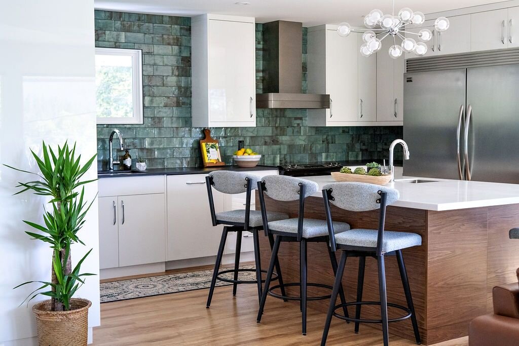
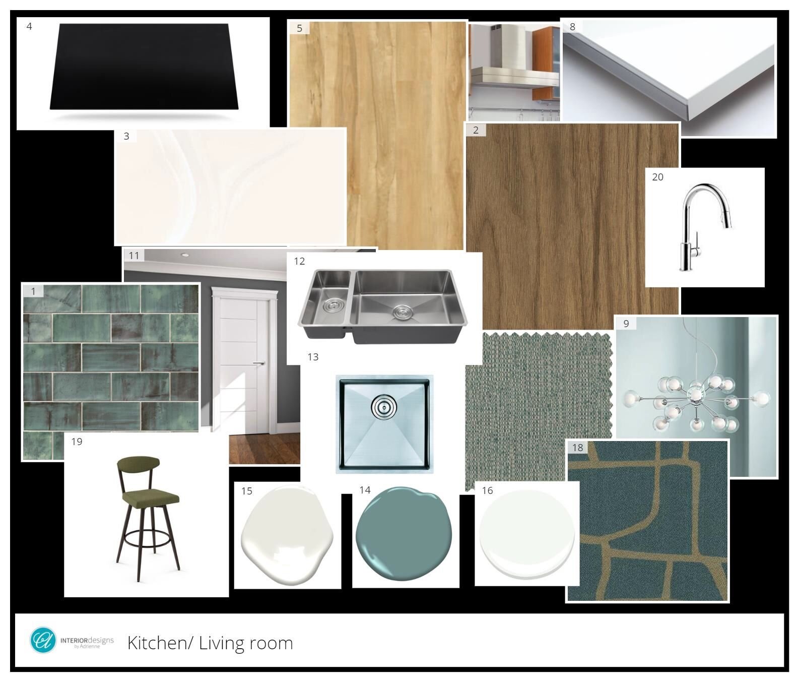
Our clients love the mid-century modern style, but keeping resale in mind, we didn’t want to go too overboard with modern style elements. We kept the fixed finishes (cabinets, counters, flooring, etc.) fairly neutral, and I added a nod to mid-century with unique lighting, sleek bar stools, and a colorful mosaic of sea green tiles.
Creating the design using my CAD software (below), I had the opportunity to collaborate with the clients in a live 3D view using all of the particular finishes we had chosen. This interactive session (included in most of my design services) allows us to collaborate in real-time. It lets us customize the design using software that allow clients to really visualize how their completed space will look and function.
Isn’t it beautiful? The tiles function as a backsplash and an art piece in the room. I can’t wait for you to see how it turned out...
The Reveal: Fresh, Mid-Century Modern Kitchen Renovation
BEFORE
As you remember from this photo, the clients’ space was small and dysfunctional. The kitchen and the dining room were crammed into a space that never should have served as two separate rooms. And now...
By removing the wall between the kitchen and dining room, we were able to double the size of the kitchen and create a much more cohesive, functional, and spacious layout. I also love how the mosaic quality of the backsplash creates depth, helping the kitchen wall visually recede and making the space feel even more spacious.
In fact, the clients recently mentioned that their too-small, U-shaped, two-person-maximum kitchen has faded into a distant memory. Since the completion of their renovation, this roomy kitchen has become the heart of the home they always dreamed of!
All of the surfaces we chose are easy to maintain, very durable, and look amazing! Since the clients’ teenage boys would be cooking in the space, counter choices were an ongoing discussion, as we knew the material needed to be essentially invincible (if you have kids, you know what I mean!).
We used Dekton counters for the perimeter surfaces, which are very hard and resist chipping. Best of all, they are stain-proof and heat-proof — for those hot pans the youngsters may accidentally forget about on the counter.
Drawers and cabinets hug the perimeter of the kitchen, and additional storage in the oversized island provides more space and functionality than our clients initially dared to dream of. With the increased space, they now have sufficient room to work, live, and cook simultaneously. The ability for those hungry boys to grab a snack without interrupting the chef…. well, that is priceless!
Some of our clients favorite functional design elements are the specific drawers we installed in the kitchen. One contains a knife block, along with built-in containers to hold whisks, spatulas, and more. Another drawer houses all of the client’s seasonings, preventing them from being haphazardly thrown in drawers and cabinets. Anyone who is busy in the kitchen and likes specific tools for cooking knows that organization is vitally important, so these types of pre-designated drawers provide for peace of mind and easy upkeep.
In contrast to the matte black countertops around the perimeter, we brightened the interior of the kitchen with a Corian island. (With the walls visually receding and the center bright, the kitchen looks extra spacious. Perception is a huge aspect of design!)
As with Dekton, Corian is incredibly durable, able to be refinished if it ever gets scratched, and is incredibly hygienic since it is non-porous.
We also knew it would be helpful for our cooking enthusiast clients to have sinks in two separate areas. The large kitchen sink accommodates the cleaning of pots, pans, and other big kitchen accessories, while the smaller sink located on the island allows for a second cook to simultaneously prepare a meal in the kitchen.
Recently, our clients mentioned that living in the space has further affirmed their decision to implement an extra large island, instead of carving out space for a dining table. They are now able to live together in the space, with some family members engaging in a hobby or project at one end of the island, while others are cooking and baking in the same space. In turn, allowing for more quality time together.
Proof that design can help families make memories together!
Despite a slight delay in receiving and installing the vent hood, once completed, the sleek design paired perfectly with the glossy white cabinets, matte black counters, and other stainless steel appliances.
It is worth mentioning, that, despite the careful pre-planning I do with my contractor prior to beginning any project, we must occasionally make the hard decision (with the homeowners’ input, of course) to move forward with a design element that may not arrive exactly on-time. This vent hood was a perfect example.
When we planned that particular element, the supplier assured us it was in-stock, but as we went to place the order, that had changed. Because the clients loved the piece, we went ahead anyway, knowing there would be a delay on the installation of that final fixture.
Fortunately, it only affected the finish date, as the clients were still able to live in their lovely new kitchen prior to the vent hood installation. And, as you can see, the stainless steel vent hood we selected paired with the gorgeous backsplash makes a statement worth waiting for, don’t you think?
Not to be forgotten, this 15-light glass pendant is not only perfectly fitting with the touch of mid-century modern style, but also adds an air of elegant playfulness to the kitchen space. This perfectly mirrored our clients’ personalities and the way they dreamed of using their space.
I bet you noticed the backsplash several photos ago, but here’s a gorgeous closeup. Since my clients and I both really love color, I was beyond excited when they approved this colorful Verona Series Verde backsplash. What began as a simple aesthetic design decision quickly became one of the clients’ favorite features, bringing warmth, color, and personality into the space in a very artistic-yet-functional way.
This functional and beautiful tile was the final finishing touch that transformed the space from stunning and sophisticated to show-stopping! And you can believe that it’s a conversation piece when the family entertains. ;)
The Beautiful Finish
Today, our clients couldn’t be happier! Their kitchen feels elegant, youthful and creative, which models the vibrant personalities of each family member. They are proud to entertain family and friends in their high-end, high-functioning, and beautifully modern kitchen.
Best of all, while we all live an “at-home” lifestyle through the uncertainty of this pandemic, our clients have expressed that they have been especially grateful for their kitchen renovation. The thoughtfully-designed space has brought the joy back into cooking for their family, effectively improving their home and their lives overall. Success!
It’s no secret — these are the projects that I love the most! It is an absolute pleasure to make a strong and smart renovation plan alongside a weary homeowner to breathe new life into a particular room. Watching them walk into their transformed space with a newfound excitement for living in their home is such a rewarding feeling — and hearing how the space has brought them closer is WHY I do what I do!
If your space is not serving you any longer, I invite you reach out to me here. With some creativity, thoughtful planning, and a dedicated team, the home of your dreams is a lot closer than you might think.
Cheers,
Adrienne


