Behind the Scenes of My Photographer's Picturesque Kitchen Reno
“Sometimes I just stand in my kitchen and wonder how it is even mine—and why it wasn’t designed like this to begin with!” — Stephanie, Client, Cranbrook, BC
Those words are music to a designer’s ears…and an exact quote from the client in our recent kitchen renovation, who also happens to be a dear friend and my incredibly talented business photographer (which made this project extra special for me in so many ways).
But before I reveal the gorgeous kitchen that elicited this response, let’s take a look at the people who inspired this modern, family-friendly space…
Creative Clients with a Cozy Aesthetic
A fun, young, working couple with two school-age girls and an adorable puppy, Stephanie and Graham were dream clients!
Having worked with Stephanie for years, she and I have an established a camaraderie that lent itself to easy communication throughout the whole process. Plus, as my photographer, her creative ideas and eye for beauty helped us establish a design that was personal, artistic, livable, and completely Pinterest-worthy!
With a background in sales, Graham has an eye for numbers and was the mastermind behind their kitchen renovation budget. (Read more about budgeting for a kitchen renovation in last month’s post.)
As a family, they love to cook, entertain, and spend time in the great outdoors. Stephanie always seems to have a sweet treat coming out of the oven and a delicious soup simmering on the stovetop…when they aren’t setting off on a hiking or camping adventure, that is.
When they approached me with the idea to remodel their kitchen, I was thrilled! How often do you get to design a space alongside another creative mind who is also near and dear to your heart? These opportunities only come along once in a while, so I didn’t hesitate before saying, “Yes! Let’s do it…”
Together, we designed a space that is modern, family-friendly, cozy, welcoming, and perfect for their busy lifestyles and warm personalities. But the process itself wasn’t quite as easy-breezy as the aesthetic in the finished space. Here’s why…
A Confusing Kitchen Lacking Cabinetry
I’ll be honest, the previous kitchen made no sense. The flow was disjointed, the space felt dark and cluttered, and the views didn’t take center stage like they should have!
The longest wall which would have been perfect for lots of cabinetry was broken up by a patio door that extended into the corner. The adjacent wall was also unusable for cabinetry because the window was too low, so I proposed moving the patio door to the dining room and replacing it with an extra large window to take advantage of the Fisher Peak views (which I also suggested we mirror on the adjacent wall - stay tuned for the amazing results!)
Before our project began, the oven and refrigerator were squished together on a single wall with only skinny cabinets in between. This layout was disjointed at best, and the cabinets were barely functional.
And then there was the issue of these close quarters…the dining room doubled as a storage area. The storage overflowed into the kitchen, and the space felt generally chaotic. But it was nothing that a thoughtful design couldn’t overcome. Once our clients figured out how to survive the renovation, that is…
The Obstacles Our Clients Needed to Overcome
Not only did this entire project take place in the middle of a global pandemic, meaning that relocating and eating out were no longer options, but Stephanie and Graham also had an extra family member living with them at the time while completing a teaching practicum.
This meant that five people spent a whole month cohabitating in their tiny basement complete with a makeshift camp kitchen. One crock pot, one instant pot, one microwave, and one folding table…let’s just say, the pandemic probably felt more like an apocalypse in those in those conditions!
But despite the occasional (and very normal) frustrations of living through a renovation, the end result was well worth the sacrifices they made along the way. Let’s take a look, shall we?
Pretty-Yet-Practical Project Inspiration
After some back and forth and lots of photo sharing, we landed on a light and airy concept that brought in a sense of openness. It was also designed to help showcase the stunning mountain landscapes surrounding our clients’ home and infuse their love of nature into each designer detail.
Each inspiration element will play an important role in the overall design… but I’ll save that for the reveal. Next, we needed to conceptualise the space…
Visualising the New Space
Part of my design process is using 3D renderings to help clients see the layout of the new space. It is especially helpful when the footprint is changing, as two-dimensional floor plans can be difficult to mentally visualise.
This rendering shows the relocation of the patio door, which was formerly in the kitchen on the left side, where there will now be a sink and window! This will offer better functionality in the kitchen and eliminate traffic through the work space.
Ready to see how it turned out in real life?
Delightful Dining Room with Tons of Natural Light
Before entering the brand new kitchen, a cozy, modern dining room welcomes you to the space, inviting you to sit and enjoy some of Stephanie’s incredible home cooking.
A transitional light fixture complete with Edison bulbs brings in a bit of an industrial flair while the white table and chairs lend a welcoming quality to the space. Framed by huge picture windows and a sliding glass door, natural light streams into the room, giving it a light, airy, conversational vibe perfect for hosting.
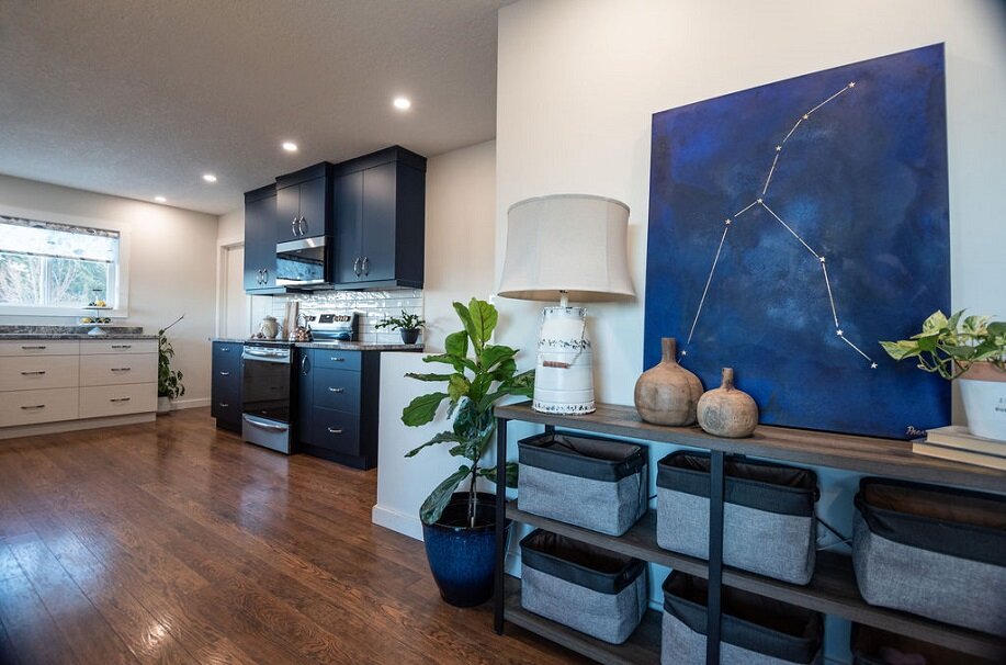
The Stunning, Styled Storage Console
As a family of four, storage is essential in every room of the home. With that in mind, we created a storage console along the dining room wall that is both practical as well as beautiful.
With designer baskets to hold household essentials and a stunning display of artwork, greenery, and accessories, this thoughtful storage solution also adds personality and pizzazz to the dining room. (Whoever said storage had to be boring?)
The Kitchen of Our Clients’ Dreams
My favorite thing in this functional new layout is that we were able to give them so much more storage. Stephanie and Graham went from having a single kitchen drawer to 20!
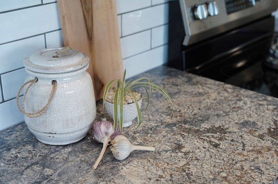
Stephanie is thrilled with the long runs of counter space we were able to provide in her updated kitchen, perfect for baking and meal prep. Not only did that increase the functionality of the room, but the stunning, stone-look countertops we selected bring the outside in and provide a perfect complement to those amazing mountains just out their kitchen window. (Can you see the mountain peaks?!)
The intentional use of greenery comes into play here as well, in the accessories placed throughout the kitchen and dining room, grounding the space and bringing the outside in.
We carefully selected window treatments that were light and breezy in order showcase the views. Plus, the floral pattern is feminine and warm, providing a welcoming ambiance that frames the world that waits for this adventure-loving family just outside their kitchen walls.
Just look at this view in the evening… it’s incredible!
In fact, that was the first thing our clients mentioned when I asked what they liked about the space. Stephanie said, “I just love how the new kitchen really shows off the gorgeous view we have. It was the thing we loved the most about the house when we bought it, and the new kitchen really accents that magnificent backdrop!”
Bold and Beautiful Cabinetry
In contrast to the very light wood-grain cabinetry that we installed around the rest of the kitchen perimeter, we chose to frame the range and microwave with deep navy blue cabinets that break up the space, bring in a splash of color, and accentuate some of the undertones in the countertops that we selected.
The white subway tile, light woodgrain cabinetry, navy blue contrasting cabinets, and gray-hued countertops are perfect for the home’s mountainous location, providing a cool palette to complement the stunning, rich, warm-toned wooden floors.
The light subway tile backsplash is the perfect selection to tie this side of the kitchen to the whites and light woods directly across the room. And the gray grout we chose? PERFECT for making those counters, cabinet hardware, and stainless steel appliances pop!
Dramatic Refrigerator Debacle
The most frustrating component of the entire project was the process of trying to source a refrigerator. I know what you’re thinking… “how hard could that be?” In normal times, you’d be right. But thanks to COVID shipping delays, this component of the project dragged on and on and on…
In fact, we ordered all of our appliances at the beginning of August, when the project began, knowing that there were shipping delays due to the pandemic. But that means we expected them to arrive in October.
In reality, the microwave showed up in November, the range in December, and the refrigerator?! Well, it never came! Talk about infuriating.
So we finally took a trip to Willow Appliances, a local showroom, and were thankfully able to get an excellent refrigerator in the exact dimensions we needed in just two days. Crisis averted!
The Functional Finishing Touches
With Stephanie and Graham’s love for entertaining, her passion for cooking, and their busy schedules as parents and working professionals, we customized the kitchen with functionality in mind, adding bells and whistles where they naturally fit.
A well-placed spice pull-out to the right of the range provides easy access to all of those flavourful ingredients whenever they are needed. Plus, this accessory keeps spices from piling up in a cupboard, never to be seen again. I know you can relate…
The in-cabinet garbage pull-out provides that kitchen necessity without having to clutter the room or take up valuable real estate on the kitchen floor.
Stephanie said, “I love having a double recycle/garbage station next to where I chop, peel, and dice all of my veggies during meal prep.” Which is exactly what we were going for! Effortless function alongside the outwardly beautiful cabinet aesthetic.
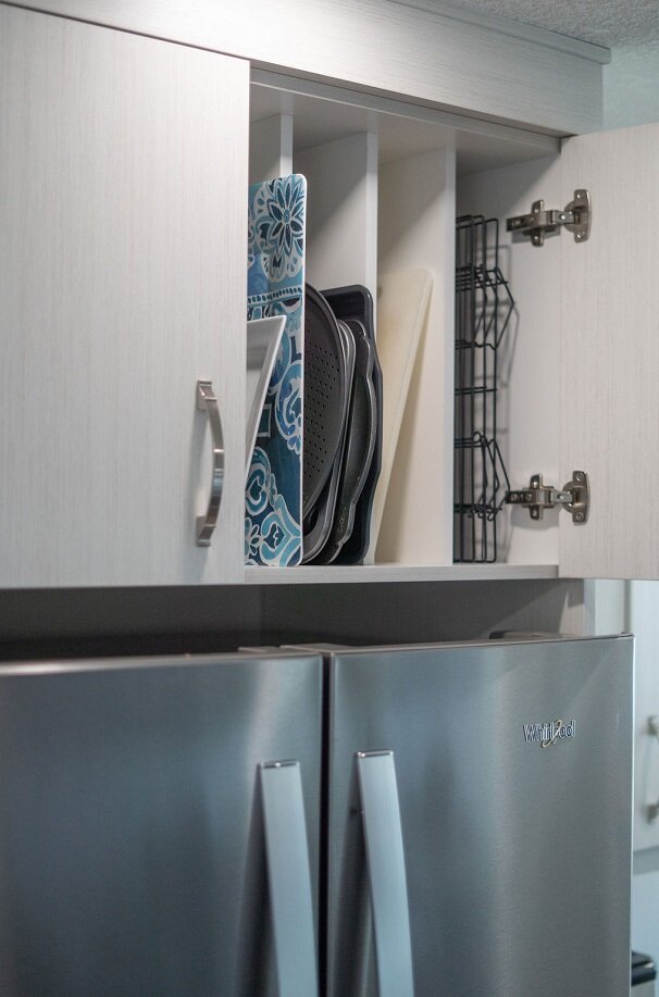
The custom partitioned cabinet above the refrigerator provides practical storage and easy access to cookie sheets, cooling racks, serving trays, and more. A home cook and hostess’s dream when it comes to accessibility!
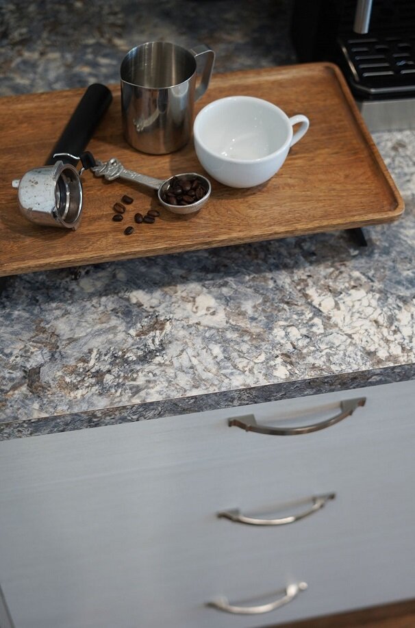
And what would a busy young couple’s kitchen be without a dedicated coffee station placed perfectly to the right of the refrigerator?! This cozy nook takes up very little counter space and provides a home base for all of those daily coffee essentials.
The Very Happy Homeowners
Stephanie and Graham loved the collaborative design process almost as much as they love their newly remodeled kitchen. Stephanie said:
“During the design process, Adrienne asked so many questions about how we would use the space, where we thought different things would be stored, how we imagined where appliances and kitchen tools would be located. It makes a huge difference day-to-day when we are living in the space. It is beautiful AND practical—which is my favourite combination—and I am so thankful we chose a designer who cares about the details to bring it all to life! It is all so thoughtfully laid out and put together.”
I couldn’t have said it better myself, and I’m honoured to have played a part! It was so much fun transforming their dated space into the kitchen of their dreams…one they will enjoy living in, entertaining in, and showing off for many years to come.
If your space is no longer working for you or bringing your family joy, I would be delighted to assist you, too. I invite you reach out to me here. With some creativity, thoughtful planning, and a dedicated team, we can bring ease and beauty into your everyday living.
Cheers,
Adrienne


